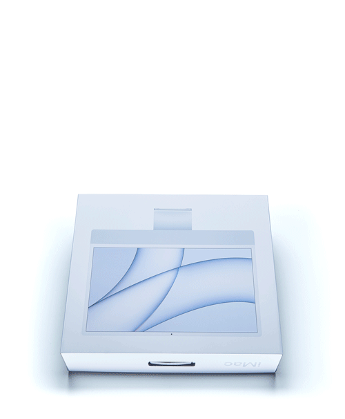
Unboxing the New iMac
We brought the colorful new iMac into our shop to meet our design team and our products—in person! I caught up with Ken Tomita, our CEO and co-founder, and Sean Kelly, our lead designer, and we took the new iMac for an unboxing spin.
- Nick LaPlante, Marketing & Product Strategy
- Nick LaPlante, Marketing & Product Strategy


Unboxing
Nick: We're doing an in-hand review with the new 24-inch M1 iMac in blue—part two of our conversation about the design (read part one here). We've got the box in front of us, so let's kick it off with some unboxing.
Ken: Let's talk about the box itself. I mean, typical Apple, it's got the white graphics on it. We noticed that the handle is fabric now, instead of plastic on the old ones.
Sean: And I love that they stuck with the handle on the box, because a lot of people used to carry their iMacs to and from places with the handle.
Nick: Ta-da. That's an amazing mechanism.
Sean: And I love that they stuck with the handle on the box, because a lot of people used to carry their iMacs to and from places with the handle.
Nick: Ta-da. That's an amazing mechanism.
Digital to Physical
Nick: Okay. So we got it open. All right, let's get it out. Computer first—how does it feel holding it, Sean?
Sean: It's so thin. I have a broken arm, but I'm able to hold it. It's not too heavy.
Ken: We shouldn't be having you holding a computer, right?
Sean: We have a guy with a bad back, and I've got a broken arm.
Nick: [Laughs] So you're saying I should do it? Alright, we’ve got it out, looking at the front in person now. What do you think?
Ken: You know that effect you get when you have the color, and then you have glass covering the front of it? It makes the glass look colored. You can't really get that in a photograph. It's obvious that it's glass in person. There's this two-tone look—I think Sean and I differ in our opinions on that.
Sean: I really like it. I like it a lot. I like how that front piece of glass just looks like it's floating on nothing. And now that we'll be going back towards this playful style, I think the white really speaks to that. And kind of showing the technology because that's what the old see-through iMac was all about. It's showing the tech kind of exposing itself.
Ken: Personally, I think if they're going to go for this, they should have gone thicker with the glass. It's so thin that it looks like a veneer that's stuck on. It looks like it's just a decoration. From a pure design perspective, I think this would have been pretty badass if the glass was like an eighth of an inch thick, you know? And you could actually see a bevel treatment on it. It looks like a facade, almost accidental.
Balance
Nick: You see it digitally, you buy it digitally, and then it shows up and you've got the physical thing. What matches your expectations, and what doesn't?
Sean: I think the thinness of the screen definitely matches my expectation of what I thought it would be. But then, actually receiving it and touching it, it's so surprising. I mean, it feels like you're holding onto a laptop. Even thinner than a laptop. What doesn't meet my expectation is the foot size. It looks a lot smaller in person than it did on the web.
Ken: I think part of it is the bias from having stared at the previous iMac for ten years. The old iMac foot feels like almost twice the surface area.
Sean: I think from the back it feels pretty well balanced. From the front is where it starts to feel almost a little unstable. But at the same time, you know it's solid. I think that's the magic of the foot. The foot is one of my favorite parts of this whole design, and especially the mechanism that holds the two things together.
Ken: I want to expand on that. So, where the hinge touches the screen, it looks impossible. That's something your brain knows—that things aren't attached at tangents like that, but you don't take a cylindrical thing and stick it onto a flat thing. And I think it's a nice effect.


It feels like an impossible feat of engineering, the way the hinge attaches to the screen.
KEN TOMITA
Co-Founder
Bottoms Up
Sean: So they made the grill go full length, even though I don't know if it's necessary that it goes full length.
Ken: It kind of looks like the speakers aren't actually going the whole way. So it's a design aesthetic feature. That's so Apple, to do something like that, where no one's going to see it, but they go crazy on it anyway.
Looking at the machining on the foot now—a little sloppy actually for Apple's craftsmanship. It's a sharp edge, and you can see that there's a little chatter. You would never accept that on an iPhone or something that's in your hand. Apple's stuff usually looks impossibly perfect.
Accessories
Nick: Okay. We've got the new keyboard, the magic mouse, a power brick, plus a single cord. This thing's awesome.
Ken: So you've got the two colors here—the neck of it is the dark anodization. And then the cord part is mirroring the front of the screen, in terms of color. The texture on this cord is off the hook. That'd be the best I've ever seen. Feels really high quality.
Ken: So you've got the two colors here—the neck of it is the dark anodization. And then the cord part is mirroring the front of the screen, in terms of color. The texture on this cord is off the hook. That'd be the best I've ever seen. Feels really high quality.


Sean: The magic mouse has been doing that glass thing for a long time. It's actually thicker. So you can see that's tied together in a way.
Ken: I mean, this was one of the original things that Apple did right. I remember when I was in grad school, I tried to imitate them hard [laughs]. I vacuum formed a plastic thing in white, and then a sheet of clear plastic on top of it. That was the thing. I mean, if you think back to that old iMac, everything about it had these clear elements, these glassy elements, and it was very playful, very bulbous.
Ken: I mean, this was one of the original things that Apple did right. I remember when I was in grad school, I tried to imitate them hard [laughs]. I vacuum formed a plastic thing in white, and then a sheet of clear plastic on top of it. That was the thing. I mean, if you think back to that old iMac, everything about it had these clear elements, these glassy elements, and it was very playful, very bulbous.


Images from Ken's grad school portfolio, 2003
Test Drive
Sean: I think this matches up really well with Grovemade products because of the softness and the warmth of where tech is heading. Grovemade products have always been about that softness and that warmth, like taking something that's cold and metal and glass and bringing that warmth in, like with our first iPhone case. And then all the way now to bringing that warmth into the home with our desk collection.
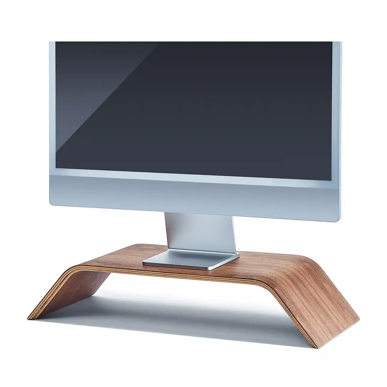
Ken: Well, the original monitor stand was designed for the iMac. Because the original inspiration was seeing iMacs on stacks of books in that classic story from Airbnb. The monitor stand is kind of the start of it all—the timeless design has really minimal lines that highlight whatever is on top of it without distracting from it.
Ken: Well, the original monitor stand was designed for the iMac. Because the original inspiration was seeing iMacs on stacks of books in that classic story from Airbnb. The monitor stand is kind of the start of it all—the timeless design has really minimal lines that highlight whatever is on top of it without distracting from it.


Sean: It's pretty creamy. The color pulls everything together, I think. Apple's product is still metal and it's still glass and it's still sleek, but because it has that playful color, it brings in that warm aspect, and paired with other warm colors and textures, it feels way different than a normal tech setup would.


It's like they were meant to be together.
SEAN KELLY
Lead Product Designer
Ken: I like the back. I mean, not a whole lot of the computer companies have really thought about the back. Most people can't see it. So if they're an eyesore—like look at the Dell, right there. Nobody wants to look at the back of that thing.
How About Walnut?
Ken: This is looking pretty dope actually. This dark theme. It's kind of surprising that it works.


Nick: In my head, this was a pure maple color.
Ken: So if you had a walnut setup and a maple setup and had all six colors of iMacs you'd have combinations for days! Refresh your desk once per month—it's a good deal.
Nick: You've got the same computer, but it does feel totally different with the different wood.
Ken: So if you had a walnut setup and a maple setup and had all six colors of iMacs you'd have combinations for days! Refresh your desk once per month—it's a good deal.
Nick: You've got the same computer, but it does feel totally different with the different wood.
Playful / Professional
Ken: So what's going to happen when Apple commits to this larger-radius keyboard design, but not all of their tech products are this playful, right? You've got space grey MacBook Pros—isn't it going to clash a bit? It works with this playful iMac, but the rest of their lineup isn't as playful.
Sean: Luckily it's a different user entirely, right? Like if you have a MacBook Pro you're not using it with an iMac because this is a computer.
Ken: It's a classic product-strategy dilemma, right? If you change one thing, suddenly the design clashes with previous products. Do you let the tension be, or do you fix it and bring everything together?
Sean: If you look at the back of this stand where you have that metal hit on the ends... what is that? What is that from? Did we see that before?
Nick: Like the original trackpad and keyboard.
Sean: The old keyboard. Right. That old keyboard would still match because you still have Easter eggs or little design language elements coming back or being used in different ways, which is the same thing that we do in our products.
Ken: The more I stare at the front of this, it's really minimal. I think it's because I'm used to seeing the logo on the front. It's striking.


Sean: They actually brought everything together. Before, that foot actually didn't quite match the screen itself. It's a beautiful foot, but the screen is square. And now everything is square and that actually works better.
An At-Home Trial
Ken: I've been using the new iMac in my home office for a little while—it works really well on a small desk, even as shallow as 24 inches. The small scale and high resolution screen work perfectly up close and personal, whereas it didn't feel right with the classic 27-inch iMac. The camera is noticeably better, enough that I stopped using my iPad for video calls.
I'm surprised that just having one fewer device in front of me gives my workspace more of a minimal feel.
KEN TOMITA
Co-Founder
Pairs Effortlessly
Pair the new iMac with our classic monitor stand and accessories, available in maple and walnut.