
Redesigning the Pen Pot and Planter
On a Saturday in 2014, a man walked into an empty woodshop with the goal of making Something Cool. The man was Ken, and the Something Cool was the original Grovemade planter. Six years later, our one-man design department had grown into an entire design team, and it was time to breathe new cool into the planter and pen pot collection.
Growing Up
The collection didn’t inspire them anymore. It felt outdated, lackluster. As for the process to make them, Ken had originally applied techniques from his background as a solo furniture maker (basically a guy in a garage). It was relatively primitive and very labor intensive, but without much benefit to our customers. We'd muscled it for years, but when COVID-19 hit, we were forced to restrict our team size for safety reasons. We were running out of capacity, and needed a more easily manufacturable design so we could get outside help to keep up.


Then there was our photographer Max. For years, Sean had listened to Max’s frustrations that the succulents were almost impossible to squish into the planters for photoshoots. Every time he attempted a seamless transition from plastic carrier to Grovemade pot, he had to downright mangle the plant to squeeze it in. Our customers were experiencing the same aggravation.


Sean’s a good listener. And when he learned that Ken and Ben were considering a different piece of metal for the inner well of the planter, he felt that familiar inspiration sparking inside him.


This could be a chance to redesign the whole thing!
SEAN KELLY
Lead Product Designer
Back to the Drawing Board
To begin, the team went all in on the planter. What were the pain points?
Inefficient manufacturing with no benefit to our customers. Too small for standard succulents. Outdated.
The team had high hopes that a spun-metal well would do the trick. They poured hours and dollars into prototyping, but when they finally received samples from the manufacturer they were crushed. The spun metal resulted in inconsistent angles and dimensions for the chamfer, and the outer edge had an imperfect, variable finish.


The vendor said there was a pricier option: deep drawn. When they got the samples of the deep drawn cup they were sold. Yes, the upfront cost would be higher. But in the long run this was the level of perfection they needed; the type of product they could believe in and be proud of.


A redesign can’t just be better for Grovemade. It has to be better for the people using it too.
KEN TOMITA
Co-Founder
Meanwhile, Sean was doing major succulent research—calculating soil volumes, and sketching out planter prototypes you could actually plant in. One step closer to fixing the size problem.
Something About Chamfers
But what about the cool factor? What was going to bring the magic? The answer was in the chamfer. (At Grovemade, the answer is kind of always in the chamfer.)
A good chamfer is a study in proportions—a discovery of relationships.
Ken, Sean and Ben thought, what if we change the proportions and make that inner chamfer bigger? Bolder?
They thought this because in the six years between V1 of the collection and V2, the three of them had designed over 50 products. They’d learned—from designing rulers, key rings, monitor stands—that a larger inner chamfer relative to a smaller outer one creates a crisp look.


That was it. Small / Large / Small changed to Large / Small / Large. They found what they were looking for.
Subtle, Serious
It’s what we call "subtle but serious." A seemingly simple change, but the key detail to an object's elegance and grace. They had the product they’d been looking for: the large inner chamfer created a spaciousness, the smaller outer one created a refined edge, while the large base chamfer created a floating effect.
The once squat silhouette had transformed, catching light on the wide steel rim and levitating right before your eyes.
From there it was an easy jump to the pen pot. Change the poetry: Large, small, large.
Also, let’s make it taller to push the pens up, and add a divider to make them stand even straighter. The pen pot that’ll always keep your pens up and never let your scissors fall.
Sean: I hate when my scissors fall.
They landed on a metal divider that cuts into the inner chamfer to stay put.


To round it all out, they updated the proportions of the dish, increasing the size of the scoop and creating a more dramatic geometry. With that, the collection was complete.


They’d progressed from V1 to V2. A progression full of changes, BUT, as Sean points out: “The shape of the square has stood the test of time.”
Spoken like a true design mystic.
Spoken like a true design mystic.


The shape of the [rounded] square has stood the test of time because the design team was there to carry it through.
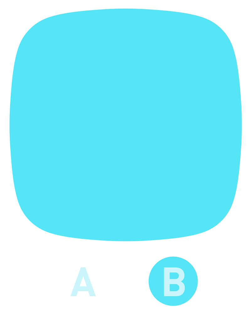
(A) shows the profile of a square with rounded corners, the more common approach. (B) shows the shape created with a spline, the shape we use in our products. With (B), the turn is gently extended around the entire shape, avoiding the optical illusion created in (A) where the sides appear to pinch inward. It’s a gentler transition from side to side.
Check out our deep dive on the spline.
Check out our deep dive on the spline.
Ken notes that for V1 in 2014, it was just him—one guy with limitations on all sides. By the time V2 came around in 2020, Ken had stepped back and Sean had stepped up, leading our product design with intention, clarity, and boldness. Ben came with an eye toward efficiencies and fluid dynamics, so to speak.
And it strikes us that Ken is a little like the outer chamfer, and Sean the inner, and Ben the base. The clean edge that knows when it’s time to step back. The bold circle that pushes boundaries. The functional base that makes it float.
All are totally present, totally necessary. The relationship between the three is what makes it work. The magic is in the proportions.
And in the chamfer of course.


