
Redesigning the Desk Tray
We designed our first tray in 2017 with the launch of the desk shelf. By 2020 it was time for a refresh.
Pain Points
Our customers needed more space to store things at their desk, and we needed to increase manufacturing capacity and quality.
Ken Tomita: We were getting photos from customers where their desk trays were packed with things. We needed a better solution.
The process to build it was finicky and labor intensive—it was impossible to outsource without sacrificing quality. So we dove into a redesign to make the tray better.
Ken Tomita: We were getting photos from customers where their desk trays were packed with things. We needed a better solution.
The process to build it was finicky and labor intensive—it was impossible to outsource without sacrificing quality. So we dove into a redesign to make the tray better.
Back to the Drawing Board
We first considered a material change. Make a tray entirely out of wood, or replace the cork with wood. But the cork won every side-by-side. We love it for its softness, its gentle way of holding things. And the metal frame adds contrast and durability without cluttering the design. Two essential parts of the tray we realized we shouldn’t change.


We also looked into adding a finger cutout or handle to the metal that would facilitate an easier slide-out. But the tray has become a stand-alone piece on many of our customers’ desk setups. To have a finger-hold of some kind would create serious interference with the clean visual simplicity.
Pro tip: Sean leaves his tray a couple inches out from his shelf, enough so that his pen well is fully visible and accessible, and his tray is oh-so-slide-out ready.
Another option was customizability. We started out hopeful that a moveable metal divider would look cool and let you personalize the wells. But it ended up looking busy.
So, another no. But all these “No” moments were making room for a bigger “Aha!"
So, another no. But all these “No” moments were making room for a bigger “Aha!"


We explored “more”, but in the end we went back to simplicity.
SEAN KELLY
Lead Product Designer


The Juice
The redesigned tray hits every goal we had for it, and goes beyond. We gave the cork room to breathe, adding a reveal between it and the metal wall, and we drew the angled walls up straight. The rounded metal wall, conversing with a rounding cork corner, meeting only just enough to anchor each other, with a world of possibilities between them.
KEN TOMITA (Co-Founder): The negative space in between is a really nice effect.


KEN TOMITA (Co-Founder): The negative space in between is a really nice effect.


As for volume, the old desk tray had a 36 cubic inch capacity. The new one has 61, a nearly 70% increase. Though we intended to increase the storage space, we didn’t imagine that we’d be able to nearly double it.
It took four major changes:
It took four major changes:
- Increase the cork thickness from .75 inches to 1 inch
- Steepen the walls of each well
- Extend the tray back ½”
- Narrow the interior dividers by ¼”
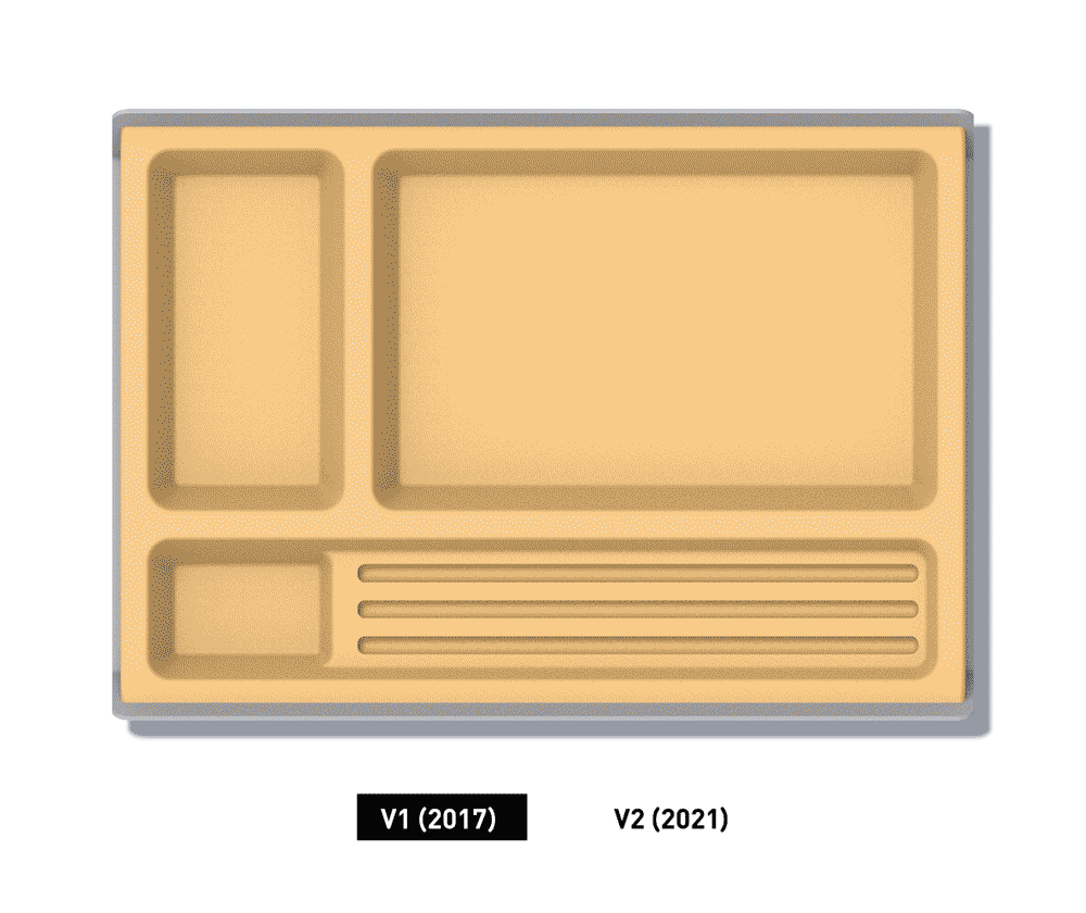
We were pumped that these small changes amounted to nearly twice as much volume. And glad that Sean had pushed to carve out just a little more, again and again.
A Study in Sophistication
Like the Pen Pot and Planter redesign, one of our challenges with the tray was to preserve its identity while updating it. Sean believes we did it, and we believe Sean. It’s metal, it’s cork, it’s classic.
But it also embraces the voids and negative spaces, giving a feeling of suspense.
It’s a design sophistication that aligns with the sophistication in manufacturing, the systematic approach to constructing an organizer you can rely on.
But it also embraces the voids and negative spaces, giving a feeling of suspense.
It’s a design sophistication that aligns with the sophistication in manufacturing, the systematic approach to constructing an organizer you can rely on.
SEAN KELLY (Lead Product Designer): It still has the same essence of the original tray, but it’s a nice update!
SEAN KELLY (Lead Product Designer): It still has the same essence of the original tray, but it’s a nice update!
In a way, the thickness of the old tray, and the clunky process to make it, allowed the new one to be carved from it. All it took was a little push.


A Place For All Your Tools
Machined from solid cork, the desk tray provides a soft and protective bed for your tools, with four pockets designed to accommodate the things you need most at your desk.


